As Art Director in the team of four, I was responsible for creating the overall look of each scene, including location, costume and mise-en-sene. In the following evaluation, I will focus on the impact of this art direction on the overall piece.
Social-realist drama, as the name suggests, needs to look realistic. To achieve this effect, I searched for costumes that were not only right for the setting, but also looked as though they belong to the characters themselves. The props were selected to look natural and as though they had been there for a long time. Above all I found locations that looked commonplace and a good fit with the background of the characters. It was important that the scenes looked completely natural with neither props nor mise-en-sene looking as though they were placed there. We avoided shots that looked contrived, neat or balanced… life for these characters isn’t like that. The work of Shane Meadows (This is England 2006) and (Twenty Four-Seven 1997) influenced me to try and depict the social classes without any romantic frills or interpretations.
We tried to ensure that their backgrounds were simply reflected in the surroundings conveyed in the shots.


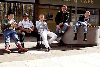
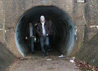
The look and feel I was going for were inspired somewhat by these shots from Shane Meadows (This is England 2006) and (Somers Town 2008), as I felt they really captured what I had in mind. The setting and costumes had the working class feel I wanted. The subtle attention to detail in costume was particularly important. It was scruffy and varied but still had the semblance of an unstated, commonly understood uniform adopted throughout by the characters. It is clear from this shot that these aspects crossed over into our own sequence.

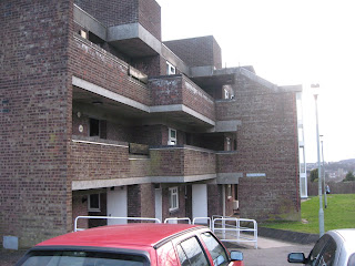
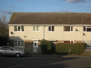
The story reflects the social ambitions of a group of lads. Their roots needed to be clear from the council estate locations and everything that this stereotype conveys about money, education, employment and the working class.


These photographs of the location, were trying to capture the essence of the characters rough surroundings. And go further in developing the narrative, the characters now have a background or environment that resembles their character and gives reasons for why they commit crime and form a gang.
However it was important to use the costumes to convey their desire to rise above their lot. Jeans and jackets rather than hoodies and trackies!
Working with the team, it was important to ensure that the other aspects of the production were in sync. True, the team wrote in the enigmatic and well-to-do character of Johnny to bring contrast to the plot and avoid an over-simplistic social statement. However, the names given and the dialogue used by the cast, the upbeat and cocky music written for the piece and the diegetic sound that prevailed all had to fit together to convey the same sentiment of confident confrontation. Above all, the direction kept the lads moving, striving and focused on a better future.
From the outset, it became clear that uniformity in costume was not going to work. They shared common ambitions and a sense of acceptable dress, but they were individuals with their own particular point of view on life. A switch to “similar but not uniform” became our revised approach. As well as these planned changes, we had also to deal with the unforeseen technical and budgetary constrains of amateur filmmaking. Some re-shoot locations were difficult to find and cut in afterwards!
My intention for the artistic direction was that it should go un-noticed! A realistic looking scene should be just that… realistic. It should not look as though it was carefully selected and constructed, even if it was. In this way, it is possible for the art direction to contribute to the overall impact of the piece. Props, mise-en sene and costumes send clear messages but should never take on a prominence in the viewer’s eye.
The piece conveyed what we intended quite well. However, a bigger budget and more technical know-how and experience would undoubtedly bring the images in our mind’s eye more visible to the audience. For example, a professional cast or at least a make-up artist could perhaps have portrayed the class backgrounds more clearly and with characters looking a little less clean-cut and well scrubbed! Labels: Art Director, Gareth Bowen |

